丁宇 | DING Yu
My Collections & Reading History in 2014
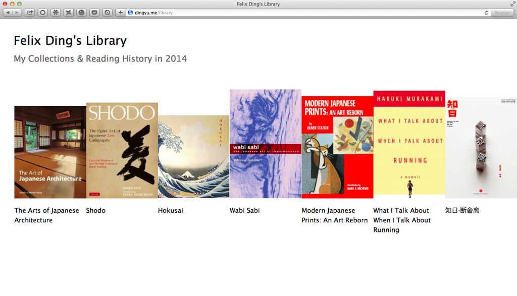
I made a simple web page that lists my reading history. Check it out:
I always want to make something that not only tracks what I read, but also displays the history nicely. Our beloved Delicious is cool but it’s not web (I know it can export the library into web pages but the design is little bit heavy), DouBan tracks my reading history but it’s not so well designed. So I end up making my own one.
During the design process, I thought about using the bookshelf metaphor in the very beginning, like what I did for catalog.im (an ebook in the cloud service co-founded by me in 2012, see here and here). But since the goal of the whole thing is present my reading history, chronological order is really the key. I came up with this:
As you can see, books are listed from left to right, new to old. It’s easy. But the real challenge lies in presenting the time sequence. Basically, that’s two things:
- When did I start reading a book, and when did I finish?
- What books did I read each month?
So the problem is how to design a timeline that works.
I tried this:
In this design,
- Each line represents a month in its own color, e.g green is April, deep orange is September etc. I follow the exact same order on a spectrum chart, which, in my opinion, matches the colors of four seasons.
- Each line has its fixed position, e.g the current month is on top, the previous month is right below the current month. So that a line that represents a specific month always stays in a fixed Y-axis position.
This design meets the goal but it’s not user friendly. The problem is how could I deliver the messages above in a clean, minimalistic and effective way? Another issue is how about the books that I have not read yet?
Anyway, after exploring the possibilities of this design and realising it’s hard to go further, I switched to another direction:
This one keeps the color scheme but presents months in a more clear way. I’m not 100% satisfied with the design as it’s technically not a time “line”. I probably will update the design when I have new ideas.


